
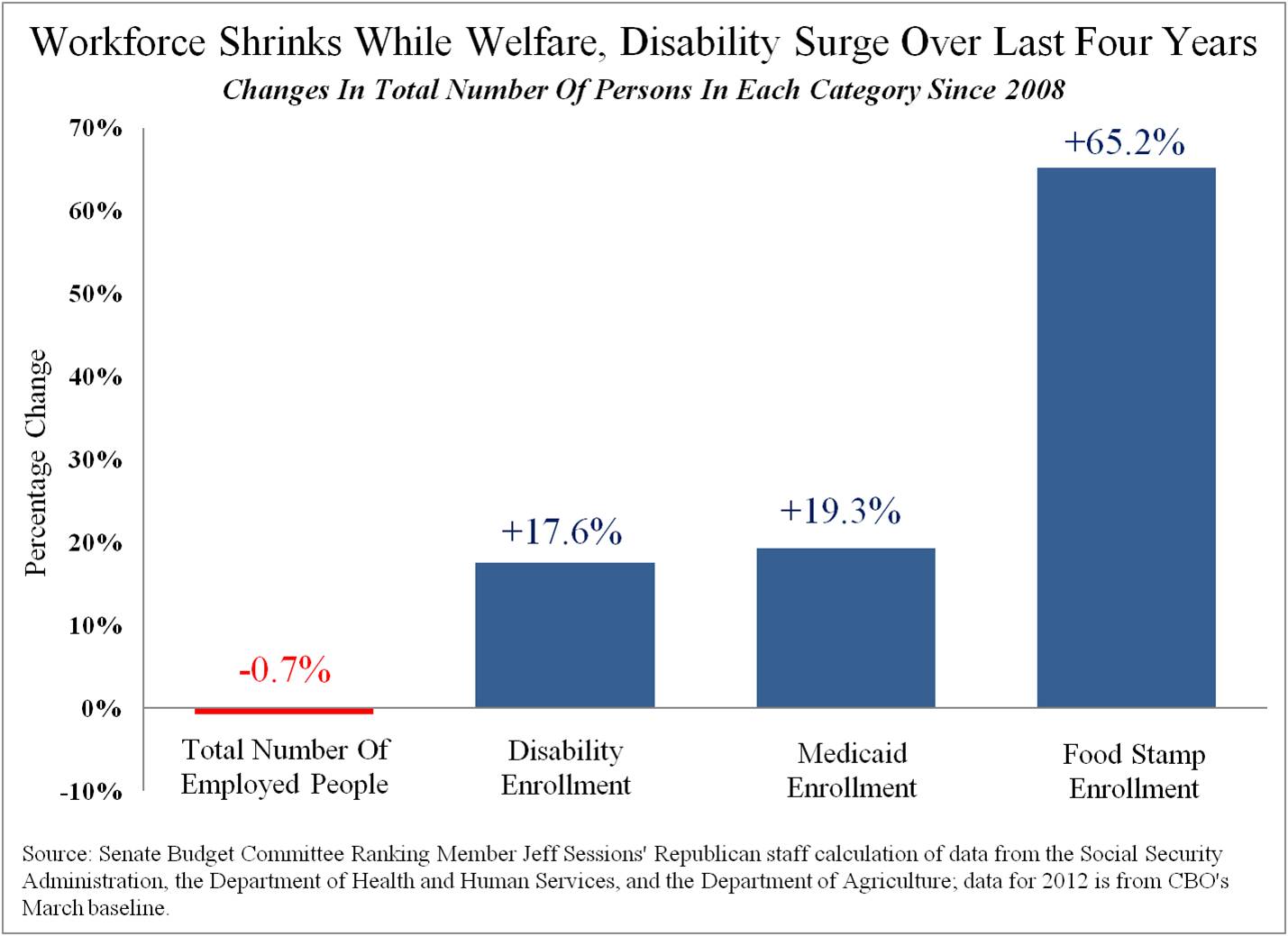
“The numbers reflect the change in the total number of people employed and the total number of people on the two largest federal welfare programs, as well as Social Security Disability Insurance, between 2008 and 2012,” the senator’s report explains.
More
1 comment:
When the jobs available (or being created) pay about the same as going on the dole, what do you suppose people are going to do if given the chance? Pride means something different than it did back when it was preferable to be working and paying one's own way.
Post a Comment